With over 5 billion people using the internet around the world and the numbers continuing to rise, it’s clear that technology is a powerhouse and it’s here to stay.
As a business owner, the power of the internet should be top of mind for you which is why you should have an optimized website for mobile use.
But how do you go about doing this? How do you make sure your website is optimized for mobile users?
Keep reading to learn more about what a mobile-first website is and how you can ensure yours is one.
Table of Contents
Prioritize Page Content
This means making sure that the content on your mobile website is the most relevant and useful to your visitors. To do this, you’ll need to carefully consider what content is most important to your audience and make sure that it’s prominently displayed on your mobile website.
Work on Intuitive Navigation
This means that users should be able to easily find their way around your site, regardless of the device they are using. One way to achieve this is to use a simple, straightforward navigation menu that is easy to understand.
Another helpful tip is to use large buttons and icons that can be easily clicked on or tapped. And make sure that your search bar is prominently displayed and easy to use.
Consider User Experience
User experience is key when determining how your mobile website will function. You need to consider how users will interact with your site and what they need to be able to do.
Performance is also crucial – your website needs to load quickly and be easy to navigate. Compatibility is important as well – your website must work on all major mobile platforms.
Avoid Popups
Popups can be incredibly intrusive and annoying on mobile devices, often causing users to abandon a site entirely. There are a few ways to avoid them, such as using progressive enhancement or detection.
But the best way is to simply not use them at all. If you absolutely must use a popup, make sure it is small and non-intrusive, and consider giving users the option to disable it.
Optimize Images
If you have landscaping or lawn care websites for example, you need to make sure that your images are properly sized and formatted so that they will look great on all devices.
One way to do this is to use responsive image techniques. This means that your images will automatically resize themselves to fit the width of the screen they are being viewed on. This is a great way to ensure that your images always look their best, no matter what device they are being viewed on.
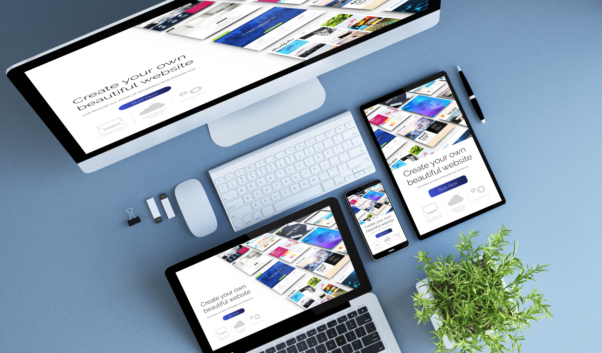
Test on Different Actual Devices
To test your website design on different devices, you can either use a device lab or test on actual devices. Device labs can be expensive, so if you’re on a budget, testing on actual devices is the way to go.
Make sure you have a variety of devices, including both high-end and low-end. Test on both popular operating systems like iOS and Android. Test on different screen sizes and on different browser versions.
Give Importance of Having a Mobile-first Website
The mobile-first approach is critical for businesses in the modern age. People are using their mobile devices more than ever to research and make purchasing decisions.
If you don’t have a mobile-first website, you’re missing out on potential customers. Give your website the attention it deserves by making it mobile-friendly.
-

-

-

-

-

-