Data Visualization in Football Explained: The Framework Every Analyst Needs Before Watching Another Match

Football analysis has always involved some level of data interpretation. Coaches have reviewed match statistics for decades, and scouts have long relied on structured observation to evaluate players. What has changed is not the desire to understand performance but the sheer volume of information now generated during every match, every training session, and every competitive cycle. The gap between collecting that information and actually using it to make sound decisions is where most analytical work breaks down.
The problem is rarely a shortage of data. Clubs at every level now have access to tracking metrics, event logs, expected goals models, and positional datasets that would have seemed excessive not long ago. The real challenge is turning that volume into something a coach, analyst, or technical director can act on. That requires a clear understanding of how visual representation works in football, what it can reliably communicate, and where it falls short. Without that foundation, adding more data often adds more confusion rather than more clarity.
Table of Contents
What Football Data Visualization Actually Means in Practice
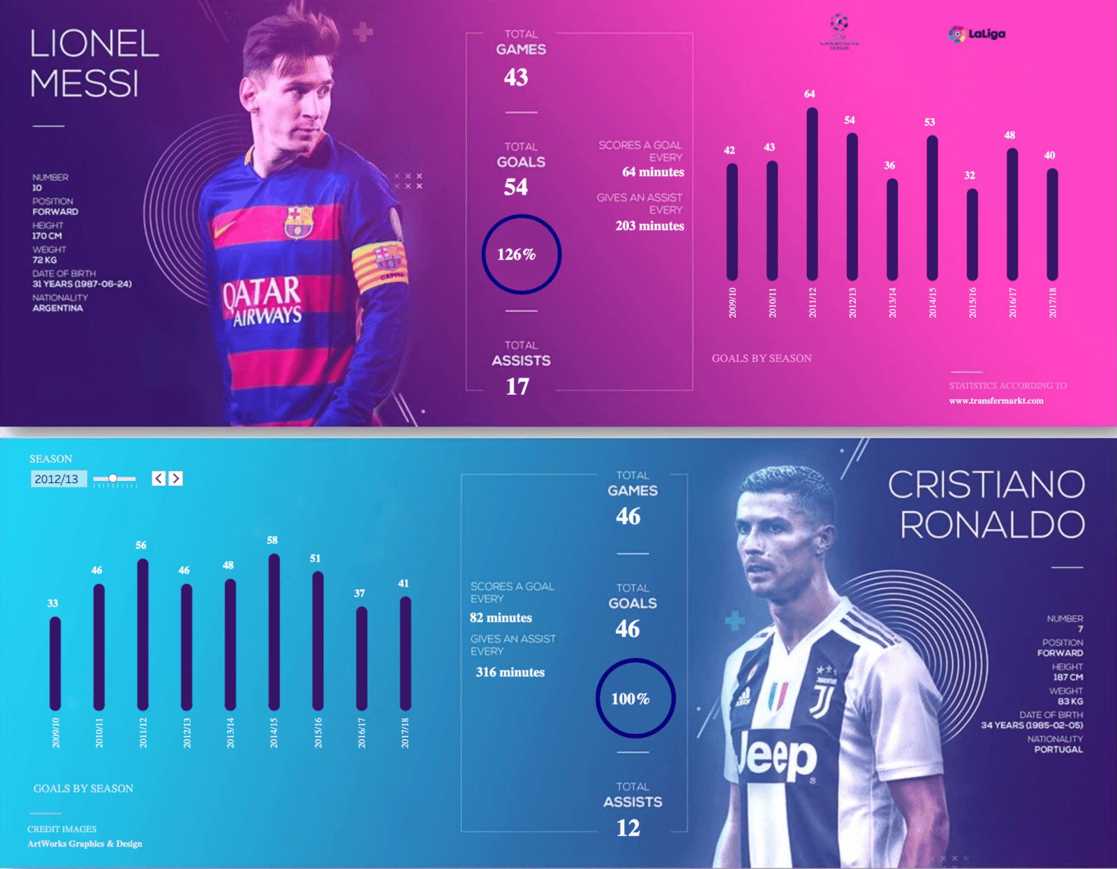
At its core, football data visualization is the process of converting raw match and performance data into structured visual formats that support faster, more accurate interpretation. It is not decoration. It is not the production of charts for presentations. It is a functional layer that sits between data collection and decision-making, and it either works or it does not based on how well the underlying data is structured and how appropriate the chosen visual format is for the question being asked.
Anyone working seriously in this area should understand that football data visualization is a discipline with consistent principles, not a collection of stylistic choices. Resources that explain these principles with operational depth — such as the material available at football data visualization — help analysts understand how data types map to appropriate visual outputs before they start building anything.
The distinction between data types matters here. Event data — passes, shots, tackles, set pieces — is discrete and categorical. Tracking data — player positions over time, movement speed, spatial occupation — is continuous and spatial. Each requires different visual treatment. Applying the wrong format to either type does not just produce an unclear chart; it can actively mislead interpretation by creating visual patterns that do not reflect what actually happened on the pitch.




The Relationship Between Data Type and Visual Format
A common failure in football analysis environments is applying familiar visual tools to data types they were not designed for. Bar charts work well for comparing discrete counts across categories. They are poor tools for showing spatial relationships or temporal flow. Heatmaps communicate positional density clearly but can mask the timing and sequence of events that give positional data its real meaning.
Understanding which format serves which question is a foundational skill. An analyst asking where a team’s defensive line tends to break will need a spatial representation that shows positional clustering over time. An analyst asking how a striker’s shot volume compares across match contexts needs a format that allows direct comparison across discrete categories. These are different questions, and they require different visual responses. Using a single preferred format for all questions introduces a systematic bias into analysis that compounds over time.
Structuring the Analytical Framework Before Building Anything
The most consistent mistake made by analysts early in their development is beginning with output. They identify a dataset, choose a visual format they find interesting, and then look for insights within it. This approach frequently produces sophisticated-looking work that answers no useful question. A more reliable process begins with the question itself — specifically, what decision this analysis is intended to support.
Decisions in football vary significantly in their time horizon and their tolerance for uncertainty. A tactical adjustment for the next match requires high confidence and narrow scope. A recruitment decision across a transfer window can absorb more uncertainty because it is made over a longer timeline with more supporting evidence. The visual framework built to support each type of decision should reflect that difference.
Defining the Decision Before Selecting the Data
Decision-first thinking changes how data selection works. Rather than pulling all available metrics and visualizing them to see what emerges, the analyst starts by articulating the decision clearly, identifying the variables most relevant to that decision, and then selecting or constructing the visual format that makes those variables most interpretable.
This also affects how much data is appropriate. More data does not always improve a visualization. In many cases, reducing the number of variables displayed makes a chart significantly more useful because it eliminates the visual noise that prevents clear interpretation. The analyst’s job is not to display everything available but to display what is necessary, with enough context to support the specific decision in question.
Context Layers That Make Visualizations Operationally Useful
A visualization without context is an incomplete analytical artifact. A shot map showing where a team’s goals came from over a season tells you something but not much. The same shot map layered with match state — whether the team was leading, level, or behind at the time — tells a different and more useful story. Adding opponent defensive shape at the moment of each shot adds another layer that changes interpretation again.
Context does not always mean adding more data to the visual. It often means providing reference points that allow the viewer to calibrate what they are seeing. League averages, positional benchmarks, or historical comparisons from the same club can serve as context without cluttering the visualization. The goal is to give the reader enough information to understand whether what they are seeing is normal, unusual, or operationally significant.
How Visualization Supports Match Preparation and Post-Match Review
The practical application of visualization in football divides into two primary workflows: preparation and review. Each has different requirements, different audiences, and different tolerances for complexity. An analyst who treats both as the same task will consistently produce work that is too complex for one audience and too simple for the other.
Match preparation work is typically delivered to coaches and players who are focused on the upcoming opponent. The visualizations used here need to be immediately interpretable. They should highlight patterns rather than raw data, and they should connect directly to actions the team can take. A defensive transition map showing where an opponent habitually concedes during pressing sequences is useful. A full positional dataset with no filtering or narrative context is not.
Post-Match Review and the Risk of Confirmation Bias
Post-match review is where many analysts fall into a well-documented analytical trap. The match has already been watched. Impressions have already formed. The risk is that visualizations constructed after watching a match are unconsciously built to confirm what was already observed rather than to examine the data independently. This is not a character failure — it reflects how human pattern recognition works under conditions of recent, vivid experience, a tendency well documented in cognitive research on confirmation bias.
The structural response to this risk is to establish a consistent post-match review process that generates visual outputs before the analyst watches the match footage. When the data is interpreted first and the video reviewed second, the analyst is in a better position to notice where the data and the visual impression diverge — which is often where the most useful analysis lives.
Communicating Analytical Findings to Non-Technical Stakeholders
Football analysis does not operate in isolation. The findings produced by an analyst eventually reach coaches, sporting directors, board members, or agents — audiences with varying levels of familiarity with data interpretation. A technically accurate visualization that cannot be understood by its intended audience has failed its purpose, regardless of the quality of the underlying analysis.
Simplification for non-technical audiences is not dumbing down. It is a separate analytical skill that requires the analyst to understand their audience’s operational priorities and translate complex findings into the language of those priorities. A sporting director thinking about squad balance does not need to see the raw positional data behind a recruitment recommendation. They need to understand what that data implies for the decision they are making.
The Role of Narrative in Visual Communication
Visualizations presented without any accompanying narrative often produce more questions than answers. A chart that shows an unusual pattern will prompt a stakeholder to ask what caused it. If the analyst has not provided that context, the chart creates uncertainty rather than clarity. Adding a brief, direct explanation of what the visualization shows and why it is relevant to the decision at hand changes how the work lands entirely.
This does not mean writing lengthy analytical reports for every visual. It means treating each visualization as part of a conversation rather than as a self-contained product. The visual shows the pattern. The analyst’s explanation connects that pattern to something actionable. Together, they make a complete analytical communication.
Closing: Building a Framework That Holds Across Contexts
The value of a structured approach to football data visualization is not that it produces better-looking outputs. It is that it produces outputs that remain useful under different conditions — different opponents, different roster compositions, different tactical priorities. An analyst who builds their process around consistent principles rather than specific tools or formats can adapt when the question changes without losing analytical integrity.
Every match generates new data. Every transfer window creates new evaluation challenges. Every tactical change shifts what metrics matter. The frameworks that hold up across those shifting conditions are the ones built on a clear understanding of what visualization is supposed to do: reduce the gap between information and decision. That reduction is what makes analytical work operationally valuable, not the sophistication of the chart or the size of the dataset behind it. The analysts and technical staff who internalize this distinction tend to produce work that clubs and coaches actually use — which, in the end, is the only reliable measure of whether the analysis was worth doing.